Login
Problem
The users need to identify themselves so that stored data about/of them can be used in the process they are inSolution
When needed, ask the users to login using a combination of an email-address and a password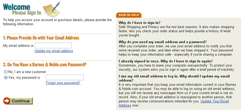
From
Use when
When users frequently return to a site that uses large amounts of data about or belonging to the users, it is convenient to have users enter that information once and use it again for future visits to the site. Usually the information that is stored is personal information and can include name, age, gender, shipping addresses, stock portfolio, bank account numbers and credit card numbers. In order to be able to access their data, users must complete their Registration first.For many site types it can be convenient to store information of/about visitor. Often these are E-commerce Site, Community Site or Web-based Application such as electronic banking applications.
How
Late loginAllow users free access of the site until it is absolutely necessary that they identify themselves. Tell them why they need to log in.
Email address and password
Use a combination of an email address and a password. Optionally the email can be filled in automatically the next time the user returns. By using the email address as "login name" users can retrieve their password if they loose it (which they will...). Offer help to users who forgot their password.
Storing username/password locally
If the users need to log in very often, it can become annoying to type in the username/password over and over again. To help users, offer the possibility to remember the username/password locally on the users' computer, e.g. using "cookies". The next time the login screen is shown all fields will be automatically filled-in and users only need to confirm. The default should be unchecked, i.e. the username/password is not stored locally.
Security
For some sites it is very important that users understand that their activities are safe enough. If so, tell users that they can use "secure" connections.
Provide feedback
Once users are logged in, let the site provide feedback that confirms this. Do not suggest that users are logged in, for example by welcoming them by name once they enter the site, when they are not.
Basic Login wireframe
The login screen usually starts with a statement that the user needs to log in, including a solid reason that should motivate the user to do so. If that statement requires elaboration, provide a link to a help text. Then the username and password fields are shown. Users can use the TAB key to go from the username field to the password field and press ENTER instead of selecting the "Log in" button. A link to help users who have forgotten their password must be displayed directly under the password field.
Depending on the amount of screen-space available, it is also possible to make a more clear distinction between new and registered users, like in the examples of Barnes & Noble and Amazon. More advanced users don't really need this and will do fine with the shorter version.
Then an Action Button is shown to confirm the login. Other relevant options can be shown at the bottom.
Some users simply enter a username/password without having registered before, expecting the system to recognize this and respond intelligently. However, usually this results in an error message but you could also try to start the registration, at least on the error page, using the username/password that was already submitted.
Why
Users do not like to be bothered with login procedures. Only if they believe they have a reason to return frequently and the benefits of registering are clear, they will actually register. Even so, they should only be asked to do so when it is absolutely necessary. This also facilitates browsing and exploring the site without commitments. Using a combination of the email address as the username and password makes it possible to email users their password when they loose it, and relieves them from remembering again another login name.More Examples
At Amazon's, the users log in with their email address and password. They are offered help in case they forgot their password.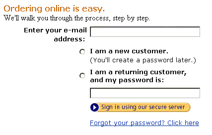
At , users get this sign-in screen that elegantly deals with the new and registered users:
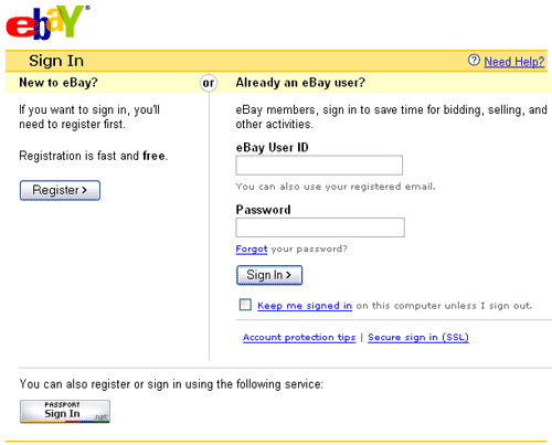
What is also interesting about this example is that you can also sign in using your Microsoft Passport. That is a system that allows you to create a "digital passport" once and use it on all site that require a login (and support Microsoft Passport, of course...).

I'm not sure if 'logout' should be seen as part of the 'login' pattern or as a separate one.
Is there a certain type of site where use of one of the two is better? I mostly use an email address because it is always unique and most people can remember their email address. If the user name needs to be unique, people will use many different user names on many different sites. Besides, you always need to ask for a email address anyway, because you like to send the password when the user forgets it.
I guess the only real issue regarding the logout is where you should send people to. Of course you can always send them to the homepage but perhaps that is not always the most logical place. What do you guys think?