Basic interactions
· Action Button· Guided Tour
· Paging
· Pulldown Button
· Slideshow
· Stepping
· Wizard
< Pattern index
Action Button
Problem
Users need to take important action that is relevant in the current context of the page they are viewing. They must be made aware of the importance of the action in relation to other actions on the page or site.Solution
Use push-button with the action 'verb' as part of the label.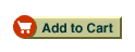
From www.bn.com
Use when
Users navigate through a site using links but not all links are conceptually the same. Normal text links are for navigating and do not have any side-effects, it is simply for going from page to page. Other links are used to create a specific effect such as starting/ending a process or committing something to a database. For example, starting a search in a Search Box, ordering a product, submitting a money transfer and so on. Such links are actions important because they can cause side-effects that cannot be undone easily or because they have other consequences for the users.Actions are typically taken on a Product Page or any result or overview pages such as found in a Product Advisor or Search Results. It holds for all of these that the users are looking at the display of an object of interest on which they intend to take and important action. Typically actions like "buy", "bid", "search", "add to cart" etc. These action are typically important because they are part of the main task sequence that is relevant on the page.
How
A push-button visually stands out on the page and is easily distinguishable from a textual link. It therefore attracts more attention than simple text link and suggests an "action" because of it's "push-button" affordance. The button can be a standard system button but more frequently it is a graphic that fits in with the overall page design. Even when it is a graphic, a 3D-look is important to create the "push"-affordance, so 'flat' action buttons must be avoided. The button should be coloured using a different color than the background colour used on the page so that it stands out sufficiently. Make sure that the button is not too small. The larger they are, the easier it is to select them. The label inside the button must contain the 'action verb' as part of the label e.g. 'buy', 'add', 'submit' etc.Place the push-button very near to the object(s) it belongs to. Quite often, the best places are above and to the right of the item itself. That way, you are can be sure that the button is visible without scrolling. Buttons used on a Form are an exception to this and the button is placed at the right-bottom location. When buttons are used in lists, e.g. in a List Builder, buttons are often both above AND below the list of items.
Why
The main reason for using action buttons is that because of their visual appearance, they get more attention and become visually distinct from normal text links. This is what is needed for important tasks such as "buy", "sell" etc.More Examples
Here is another example from www.ebay.com where action buttons are used for making a "bid" on an item that is up for auctioning: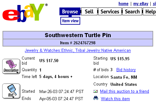

Therefore, if the action is perceived to be a hyperlink to a page with actions (Example - View Cart), then a graphic button is appropriate relative to user mental model. In comparison, if the action is a user core goal (Example - Delete), then a system button is a more appropriate selection given the binary mental model of system buttons.
This pattern is even more true when target users include those with disabilities who may be accessing the page via Assistive Technology or User Agent.
cheers,
Greg