Page types
· Article Page· Blog Page
· Case Study
· Contact Page
· Forum
· Guest Book
· Homepage
· Newsletter
· Printer-friendly Page
· Product Page
· Tutorial
< Pattern index
Article Page
Problem
Users need to read a reasonable amount of textSolution
Present the article in a consistent and structured format, and place it in the center of the page.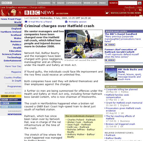
From
Use when
You are designing a News Site, Portal Site or similar site, where users come to read stuff. What users are reading are 'articles' and not longer stories that you may find in online brochure or dossier.How
Every article page you may encounter will have a slightly different format but most of them share these basic elements:- Header, in a large font size and preferable not spanning more than one line
- Publication date, in a small font size
- Photograph with caption, half or the column width or the entire width.
- Introduction text, which often serves as sort of a summary as well
- Body text, the real content of the article
- Links to related articles, either external or internal articles
After the body text, there may be a 'local' Footer Bar with a Send-a-Friend Link or link to a Printer-friendly Page. Alternatively, such a bar can also be put at the top of the article as well. In some cases, an article may span multiple pages and needs Paging. Only use it when there is special content such as a high-resolution image on the second page, otherwise it is best to keep article pages on 1 page. On some sites, it is also possible to add a page to a list of Collector so that users can easily find them back later.
In order to make the site a bit more interactive, sites with article pages also allow people to react on the article. That way a sort of small Forum will arise with the comments being displayed at the bottom of the page.
Why
The article deserves the space and actually needs the space for readability reasons. The rest of the links above and below the article belong to the article and are in easy reach.More Examples
This is how CNN does it: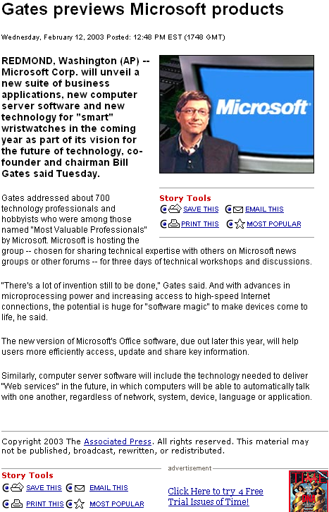

Comments

0 comments have been added to this pattern