Outgoing Links

Problem

Users need to know when links will take them away from the current site.

Solution

Mark links to external sites with an icon after the label

From Wikipedia

Use when

Most websites use a combination of internal links and external links. However, when the majority of the links are internal, the external links become the exception, for example in a News Site. In contrast, in a Portal Site or Blog Page the balance is usually towards external links. So when links to external pages on other sites are not the norm, it is good to tell people that the link they are about to click will take them away from the site they are browsing.

How

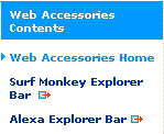
Mark the links by adding an icon after the link label. When outgoing links are selected a new window is opened. Usually the icon is a combination of an outwards pointing arrow and a shape, for example:

Sometimes the meaning of the icons is explained in the Footer Bar.

Why

By adding an icon, or other kind of marking, users know that such links are different and what to expect when they click on them. Marking the link will not solve any major usability issues with your site but it will subtly manage expectations of users as they browse the site.

More Examples

This example is from CNN.com:


This example is from CNet News.com:
Other sites include Gmail, Randombit and many others.

Literature

External links and the Web Content Accessibility Guidelines 1.0

Also known as

External links
Offsite links

Code examples

Iconize links in CSS
External links icons the CSS way External links icons the CSS way
plml logo

Comments

9 comments have been added to this pattern


jhewitt, 29th August 2007
Why add the icon after? Why not add the icon before? Just curious.
Martijn van Welie, 29th August 2007
I'd say that the main reason for putting it behind the link is because the link itself is more important. If you'd put the icon before the link it would give too much emphasis.
Eric Shepherd, 29th August 2007
Are you suggesting that external links should always open a new window? Should an icon only be used if the link opens in a new window?
Marcin Szuba, 2nd September 2007
How about external links should be opened in a new tab or window and they be described by text that they are outgoing links
Are icons meantioned in a text too small to recognize their meaning. It's not an affordance.
How many users know what does these icons mean.
Correct If I am wrong
Roberto Bonvallet, 7th May 2008
I hate when sites open links in a new window. I want to be able to decide whether I stay in the current site or not.

A site should not open links in new tabs ever. It is annoying, and it gets really confusing when you have to follow several links in order to get somewhere, and you end up with a lot of open pages that you don't need anymore.

Having outgoing links subtly marked helps the user to control the navigation the way she prefers.
Frank Gürgens, 26th May 2008
Some prefer opening new windows on outbound links some don't. That's why three different icons are needed:
Arrow: Outbound link, no new window opening
Rectangle: Inbound link, new window or popup opening
Rectangle and Arrow: Outbound link, new window opening

Marc Desbiens, 5th March 2009
As a rule of thumb, one should not launch an external link in a new window. Instead, simply include the external link icon, and a title attribute stating "This link will take you to an external web site." This gives the users the opportunity to launch the link in a new window/tab themselves, or within the same window if they are fine with leaving your site.

Forcing a new window/tab presumes -- almost arrogantly -- that the user could not possibly want to leave your site, and that by keeping your site in a window that the user will somehow feel obligated to stick around. It also shows a lack of confidence, as if to say that you don't believe a user would ever want or be able to return to your site should they choose to later on, so you'd best try to "keep them there" at all costs.

That said, launching external links in new windows can be a gray area when dealing with web applications where the user has logged in. Launching an external link within the same window would cause the user to be logged out, potentially interrupting a task in progress. Obviously, external links should most definitely be clearly labeled in these cases, and ideally kept to a minimum.

Providing multiple icon types just puts more cognitive burden on the user. Including the external link icon is pushing it - not all users will notice or comprehend it. But adding many icons becomes tricky. Which icons instantly convey the function of the link? One could argue that the icons could be interchangeable -- switch the icons around and they are just as meaningless. We shouldn't need to include a legend for users to understand something as simple as navigating via text links.
Russell Sprout, 21st December 2009
Spot on Marc Desbiens, 5th March 2009
Bobby Jack, 5th December 2010
"Users need to know when links will take them away from the current site." Why?


Add a comment
Do you have something to add or say about this pattern? Perhaps some more examples of how this pattern is used in the wild? Add a comment to this pattern and I'll update the pattern when necessary. Please abstain from misuse. I reserve the right to delete or modify inappropriate postings.

Your Name

Comment

Enter the verification code you see in the image below
captcha