News Ticker
Problem
The user needs to stay updated about certain facts regardless of what he is currently dingSolution
Use a box with scrolling text to display the latest info and place it at the top part of the page.
From www.ft.com
Use when
A News Ticker is typically used on a News Site or a Financial Site. There the user may be browsing for other information and the news ticker can keep updates coming by.How
Place the information of interest (News, stock quotes, football scores etc) in a box, separating each item using white space or dots. Then let is scroll slowly right to left (or inverse for languages that are read from right to left). Alternatively each item can also fade in and out instead of scrolling but then the previous items are not visible.Why
A news ticker is perhaps not the most usable thing but it isn't intended to interact with. It is there and people can look at it while they can do other things. The version where fading is used is good for things linke headlines but it is not good when the items are in a certain order or take very little space such as scores or quotes.More Examples
A ticker for stock quotes on a financial site: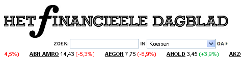
An example from CNN:

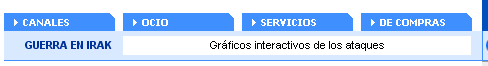
This example is from www.abc.es:

- users have no idea how long it is
- where they are in the list
- cannot control the speed
- cannot go directly to the part of interest
Interaction design is about control. Not something people watch passively in the same way like on TV or outdoors at Times Square watching tickers go by.
I do agree with the fact that it shouldn't be too distracting because otherwise you'd be better of using large headlines on your site or give the information a more permanent place.
I don't like tickers at all, just because it makes kind of anxious (information anxiety sort f thing). But my clients do, and demand them on their websites. I also don't like the idea that i might miss something important and never finding it again, or maybe not reading the first words of the scrolling text and not getting the whole idea.
I guess there's is something much better than scrolling text: one text replacing another, offering control to the user. A good example is the Guardian's "Breaking news" ticker (http://www.guardian.co.uk/). You can stop, go back and go forward and the text is shown with a "typing effect".
By the way: this is one of my favorite sites for patterns. :)
When you say:
"They are there and you can look at them if you want. Otherwise you just go on doing what you want to do."
I think that habituated users have more freedom in choosing whether to look at a ticker or not. A first time, or irregular visitor will be more distracted by the added noise of a moving object on a page. They will spend more time processing whatever information is in front of them, including layout and design features. A habituated user can automatically process information without exercising conscious control, while consuming little in the way of attentional resources. Casually keeping an eye on sports scores is easier for regular users, but not so much for people who visiting a new site.
Also, it is annoying if it is the only way the user can find to get to the desired information.
I prefer the idea of user-centered control, as mentioned by Elisa and David. This takes full advantage of web technology, which is largely interactive, as opposed to passively watching a television.
the above comments were very helpful for me but i need more point of views regarding news tickers on television, that how people perceive them (negatively/positively) and why?