Input Error Message
Problem
Users have entered input that could not be validated and they must be prompted to correct the inputSolution
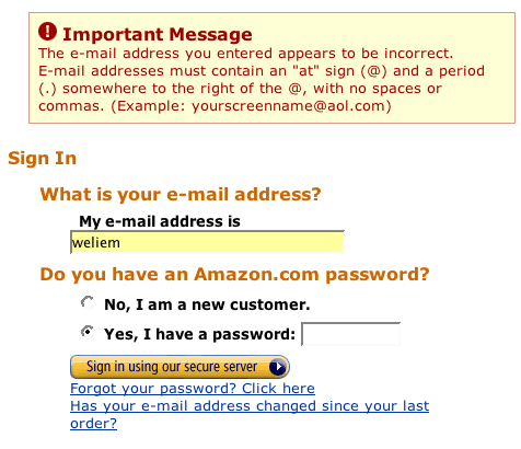
Tell the users that there is a problem and how to solve the problem. Also tell the users where the problem occurred.
From www.amazon.com
Use when
Users have are trying to fill in Form and one or more of the fields is syntactically invalid or missing. Usually, there two kinds of problems: a) the field has not been filled in at all, or b) the field contains data in the wrong format.How
The error message that is given needs to tell the users:- That an error has occurred. This is best done by displaying a colored box at the top of the page containing a "important notice". The notice must say what the problem is and that the users can repair the problem by going to the "problem"-field and changing the input.
- Where the error occurred. This is also done by stating the problem fields in the box at the top of the page in combination with a marking at the problem field itself. For example, the form widget can be colored as is done in the example above.
- How the error can be repaired. This is done by giving repair information next to the problem field. This information must be marked visually in order to stand out as being "help information". Usually, such help information tells to users about the correct syntax of the entry field.
Why
Obviously, users must be made aware of the fact that there is a problem. Doing this a the top of the page in a visual distinct box assures that users will see it. In addition, users must receive helpful information that will put them on track again. TO achieve that it is important to give help information near the problem field itself so that the "problem" and the "solution" are close to each-other.More Examples
This example from www.vanguard.com shows a variation where a popup window is used to display the error message.

The goal of the pattern is to improve the user experience by minimizing input errors. The objectives of the pattern is to (a) inform user that an error occurred during input, (b) notify user where the input error occurred, and (c) minimize the likelihood of a repeated input error. User experience plummets when users are notified multiple times that there were an input error.
To add to Martijn's point in his first example, the solution here is twofold:
(1) Notify user of error and prescribe correct information required for input at the beginning of the input form (as included in the first example image used above), and
(2) Provide users with an example of the correct information again at the applicable data entry field (Example - placing "Example: name@email.com" above or below the Email Address text entry box).
cheers,
Greg
* Consider language (tone of voice, are you scolding a person whom you have never met?)
* visual presentation (red means danger, is this really a dangerous situation for the user?)
* location (consider flagging up the exact location on the page, especially on a page with a lot of scrolling. Visually connect the error and the error notification. Not doing this will add to the user's stress.)
The short answer is "it doesn't".
However, it is possible to go the long way - the page can be submitted, checked by a program, and redisplayed to the user with the errors highlighted.
It takes longer to do this, but the result is the same.
Regarding user stress and the colour red. Having developed several systems and having interacted with various levels of users, I can assure that "red" does not always mean "danger".
Red = Danger is one of several interpretations. Perhaps if you were in a car, yes, red would be intepreted as Danger. On a web page? Where is the danger?
Red is primarily used to significantly highlight sections of the page. See the example above where it draws your eye directly to the place of error.
Blaringly obvious? Yes. But, that's the point.
In a recent project, we found that the CA software did not highlight errors. No red. No nothing. Just throws a message up saying that there is an error. It is horrible.
For further reference, try a google search --> http://www.google.com.au/search?q=using+red+to+indicate+error
There's lots of references there.