Navigating around
· Accordion· Headerless Menu
· Breadcrumbs
· Directory Navigation
· Doormat Navigation
· Double Tab Navigation
· Faceted Navigation
· Fly-out Menu
· Home Link
· Icon Menu
· Main Navigation
· Map Navigator
· Meta Navigation
· Minesweeping
· Panning Navigator
· Overlay Menu
· Repeated Menu
· Retractable Menu
· Scrolling Menu
· Shortcut Box
· Split Navigation
· Teaser Menu
· To-the-top Link
· Trail Menu
· Navigation Tree
< Pattern index
Headerless Menu
Problem
Users need to access the main sections of the siteSolution
Combine menus in a vertical menu using different visual clues instead of headers
From www.emerce.nl
Use when
The information structure of the site has two or more parts. The main part serves the primary purpose of the site. The other parts are more or less independent of the main part and serve a secondary purpose. The main part typically has too many sections for a horizontal menu and must therefore be displayed vertically. Most users will need to see the main part first.How
The main part is placed at the top and has an accent visually so that it is perceived as the main part of the site. The other parts have a modest appearance so that they do not compete for attention with the main part.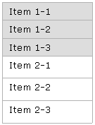
> open wireframe <
Why
Since the main part contains many items, it should be displayed vertically. This rules out a horizontal menu for the remaining parts so they must be displayed vertically as well. The vertical order and the visual design are important to communicate the differences in importance. An important advantage is the fact that no separate headings are needed for the parts.More Examples
This example from the Financieel Dagblad site shows two sections.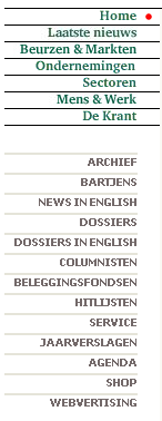

This way it works http://www.welie.com/patterns/wireframes/combined-menu.ppt