Liquid Layout
Martijn van Welie
Users must be able to read text comfortably regardless of the browser window size.
Basically any website can benefit from this pattern. Nonetheless, the pattern is most effective when used on pages where the is a lot of stuff to be read such as a .


From
www.wired.com
Allow certain parts of the page to scale
The basic page design must be such that text is readable already. But when users enlarge their browser window, the readability must increase. You must decide which parts of the page will scale along and which ones stay fixed. There is always a main content area that is on the . That one should scale. Other columns with related stuff or navigation usually does not scale.
Scaling the main content area helps users reading the main content. Other sections do not need re-scaling because they do not contain long content that users come for e.g. related sections, navigation, commercial stuff etc.
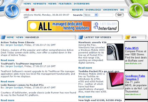
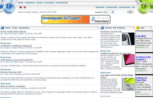
At www.infosync.no the left column scales while the two right colums keep the same width: